The Data Properties of a Control
Whereas Format properties
affect the appearance of the control, Data properties affect the data
that displays in the control. In this section, we explore the various
Data properties. We cover everything from the Control Source property that determines what data displays in the control, to the Input Mask
property that determines what data the user can enter into each
character of the control. As you’ll see, there’s a very rich list of
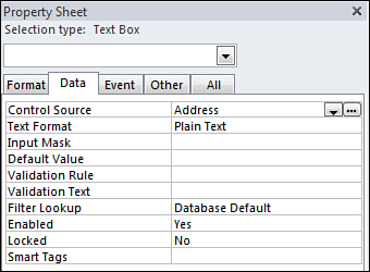
Data properties for a control. They appear in Figure 3,
and many are described in the text that follows. To access the data
properties of a control, select the control, open the Property Sheet,
and click to select the Data tab.

Control Source— The Control Source property specifies the field from the record source that’s associated with a particular control. The Control Source property can also be set to any valid Access expression.
Input Mask— Whereas the Format and Decimal Places properties affect the appearance of a control, the Input Mask
property affects what data the user can enter into the control. The
input mask of the field underlying the control is automatically
inherited into the control. If no input mask is entered as a field
property, the input mask can be entered directly in the form. If you
entered the input mask for the field, you can use the input mask of the
associated control on a form to further restrict what the user enters
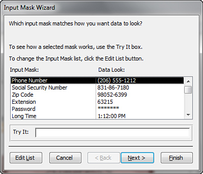
into that field via the form. If you select the Input Mask property and click the Build button, the Input Mask Wizard appears (see Figure 4).

|
If a control’s Format property and Input Mask property are set to different values, the Format property affects the display of the data in the control until the control gets the focus. When the control gets the focus, the Input Mask property prevails.
|
Default Value— The Default Value
property of a control determines the value assigned to new records
entered in a form. You can set this property within the field
properties of the underlying table. A default value set at the field
level of the table is automatically inherited into the form. The
default value set for the control overrides the default value set at
the field level of the table.
Validation Rule and Validation Text— The Validation Rule and Validation Text properties of a control perform the same functions as they do for a field. This means that the Validation Rule enables you to validate the data that users enter into the control, and the Validation Text enables you to supply users with the error message that appears when they enter a value that violates the validation rule.
|
Because a validation rule is
enforced at the database engine level, the validation rule set for a
control can’t be in conflict with the validation rule set for the field
to which the control is bound. If the two rules conflict, the user
can’t enter data into the control.
|
Enabled— The Enabled property determines whether you allow a control to get the focus. If this property is set to No, the control appears dimmed.
Locked— The Locked property determines whether the user can modify the data in a control. When the Locked property is set to Yes, the control can get the focus but can’t be edited. The Enabled and Locked properties of a control interact with one another. Table 1 summarizes their interactions. Where you see the Enabled column equal to Yes in the table, that means that the Enabled property is set to Yes. Where you see Locked property equal to Yes in the table, that means that the Locked
property is set to Yes. The third column shows the effect of the
combination of those two property settings. For example, if you set Enabled to Yes and Locked to Yes, the control can get the focus and its data can be copied but not modified.
Table 1. How Enabled and Locked Properties Interact
| Enabled | Locked | Effect |
|---|
| Yes | Yes | The control can get the focus; its data can be copied but not modified. |
| Yes | No | The control can get the focus, and its data can be edited. |
| No | Yes | The control can’t get the focus. |
| No | No | The control can’t get the focus; its data appears dimmed. |
Filter Lookup— The Filter Lookup property indicates whether you want the values associated with a bound text box to appear in the Filter by Form window.
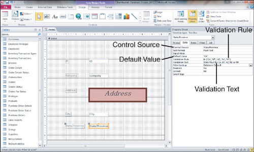
Take a look at the example in Figure 5. Notice that the text box control has its Control Source property set to State/Province, indicating that it is bound to the Region field in the underlying data source. Its Default Value property is CA. This means that when the user adds a new record, the Region field defaults to CA. The Validation Rule property connotes that the Region must be CA, UT, AZ, NJ, or NY. The Validation Text property provides the error message the user will receive if the user violates the validation rule.
